Merchant Specific preferences
Styling
Membership App- vs. Aera UI
- Some design elements, like the Payment UI, are implemented by either the Membership App or Aera. Onboarding and signing via Identity providers, biometrics and App Pin, as well as the Wallets Dashboard for managing the payment methods, are always provided by Aera. See "Mobile app vs SDK responsibilities".
Android Status bar
The StatusBar is light grey by default and can be overridden.
// res > values > themes.xml:
<item name="android:statusBarColor">#F1F0F3</item>
<item name="android:windowLightStatusBar">true</item>
// app > src > main > AndroidManifest.xml
<application
tools:replace="android:theme"
android:theme="@style/Theme.MyTheme"
// ...The theme must be replaced if using a different styling
Preferences and configurations
Preferences
Preferences are based on system settings on the device.
The following preferences related to the Wallets UI are supported
- Language
- Light/Dark mode
Language
Supported languages based on
- App system settings using
- Android: Locale.getDefault()
- iOS: Locale.preferredLanguages.first
- Device system settings
- If not supported, fallback to English
Current supported system languages
| Language | Key |
|---|---|
| English (Fallback) | en |
| Norwegian | no / nb / nn |
| Dutch | nl |
| French | fr |
Light/Dark mode
Light/Dark mode is available based on system settings.
The WSP Config also allow for overriding branding based on theme. See "Configurations" section.
Configurations
The following configurations related to the Wallets UI are supported
- Supported participating payment systems (PPS). Displayed in the "Add" dialog in the Wallets Dashboard.
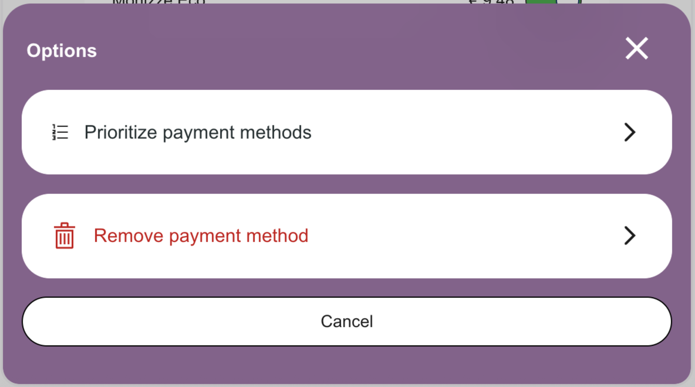
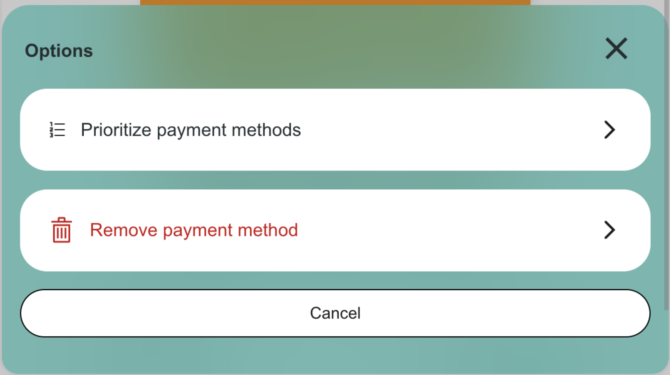
- Branding. Colors for light and dark mode are represented in the primary buttons and dialogs of the Wallets Dashboard to better suit your brand.
Branding
The Wallets Dashboard allow some branding elements to have overridden colors.
The WSP Config needs to include a branding object with set colors "brandPrimaryColor" and "brandPrimaryColorDarkMode". These colors will be used for the Wallets Dashboard primary buttons and dialogs.
Contact Aera to update your config. For branding, provide the two primary colors: one for light mode and one for dark mode.
See example: